
AI Stickers: Why Your Pack Falls Apart When You Make It One by One
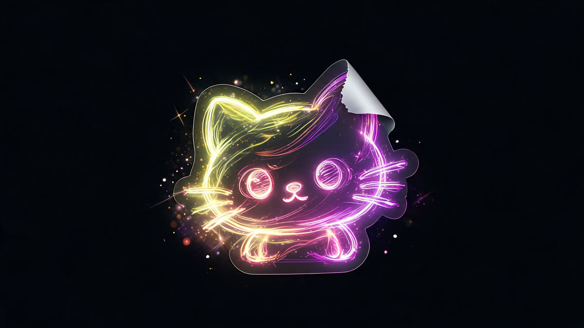
AI stickers often turn into ten unrelated faces. Here's how to keep one character, cover real emotions, and avoid file-format headaches.
Most people making AI stickers do the same thing: generate ten images and drop them into a pack. What they end up with is ten different characters who have nothing to do with each other. Nobody sends stickers from a pack like that.
What actually makes a set feel like a set
One character across every sticker. This is the hardest part to pull off.
One art style: line weight, color palette, level of detail, all consistent.
One scale: the character takes up roughly the same amount of frame in every image.
A set of emotions that covers what you actually say in chat.
Readability at tiny sizes, because a sticker gets viewed at roughly the size of a thumbnail.
Keeping the same character across every sticker
Describe your character in detail: type or body shape, colors, one defining feature, clothing. The more specific the description, the less the model drifts between generations.
Get one sticker right first, then use it as a reference image for the rest of the batch.
Change only the emotion and pose in your prompt. Copy everything else word for word.
Generate the whole batch in one sitting instead of spreading it across several days. We cover the broader technique for keeping a series consistent here.
Give your character one bold, specific detail: a hat, a scarf, an unusual color. That one detail does more for recognition than overall likeness.
Which emotions you actually need
Look at your own chat history instead of some generic list you found online.
A baseline set that works for almost anyone: agreement, laughing, confusion, exhaustion, approval, refusal, greeting, thanks, waiting.
Beyond that, it depends on the chat. Work chats need different reactions than a group chat with friends.
Nine stickers people actually send beat thirty polished ones that mostly never get used.
Technical requirements
Transparent background. A sticker sitting on a white square reads as a sticker that doesn't belong there.
Square format and a specific pixel size, since every messaging platform sets its own spec.
A contrasting outline. On dark mode, a light-colored character with no outline just disappears.
File size limits. Packs have caps on total size.
Skip fine detail. At real display size it turns into mush anyway.
I put together a set of twelve stickers. Four of them actually stuck in my regular chats. The rest were nice to look at, but nothing ever came up that called for sending them.
One of those four, oddly enough, I added at the last minute almost as an afterthought. It's the one I use the most.
FAQ
How do you keep the same character across a whole sticker set? A detailed description, one reference sticker to match against, and changing only the emotion and pose in each new prompt. A bold distinctive detail, like a hat or a signature color, makes recognition stick.
How many stickers should a pack have? Nine that people actually use beat thirty that just look good. Base your emotion list on your own conversations, not a generic template.
What are the technical requirements? Transparent background, square format matching your platform's spec, a contrasting outline, and no fine detail that disappears at small sizes.
Why does a sticker read poorly on screen? Because it's viewed at close to thumbnail size. Thin lines and small details vanish at that scale.
Why did only part of my set end up getting used? People send stickers when there's a reason to, not because the artwork is strong. Build your emotion list from your real chat habits, not a wishlist.
Sources
- Flami: how to create a character with AI
- Flami: keeping a consistent style across a shot series
- Flami: how to remove the background from a photo
About the author
Jake Turner
Reviewer at Flami